
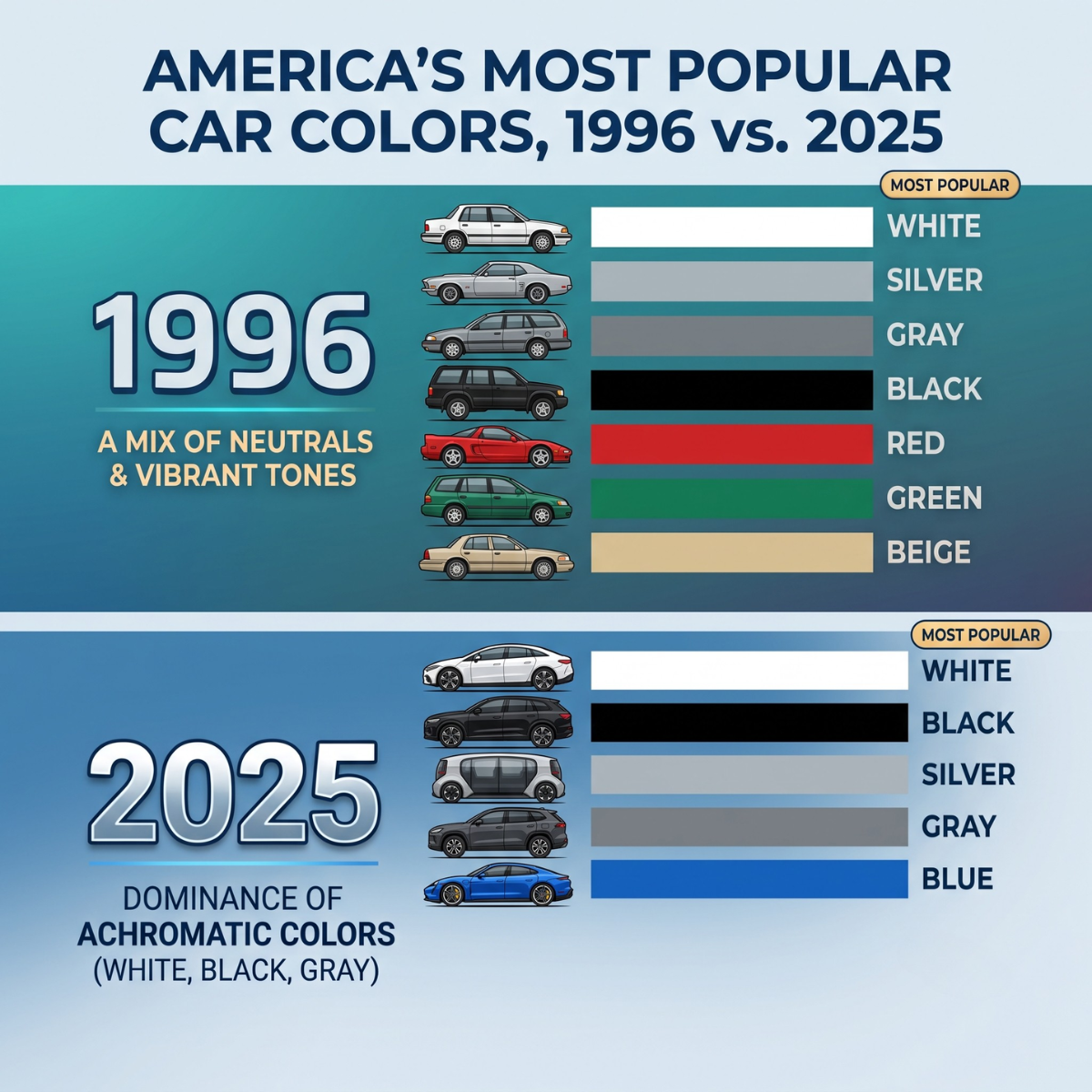
In 1996, colorful cars made up more than half of the auto market. Grayscale shades – white, black, gray, and silver – accounted for only 47.3% of new vehicle sales.
Today, that landscape has changed completely. 80.4% of all new cars sold are grayscale. White leads the pack, followed by black, gray, and silver. Blue, red, green, and yellow have been pushed to the absolute margins.

| Year | Distribution Breakdown | Visual Market Share |
|---|---|---|
| 1996 |
47.3% Grayscale 52.7% Chromatic |
|
| Today |
80.4% Grayscale 19.6% Chromatic |
Source: Visual Capitalist
Most cultural commentators claim that modern consumer taste simply turned boring. That is an incomplete explanation. Consumer taste did not spontaneously collapse into gray.
Production math, dealer risk aversion, and asset protection killed color.
Even worse: this exact same mechanism has infected consumer packaged goods (CPG) and fast-moving consumer goods (FMCG). Walk down any modern supermarket aisle, and you will see the exact same “grayscale” problem hiding behind beige boxes, pastel pouches, and minimalist sans-serif typography.
Here is the operational reality behind the loss of color in automotive, why retail brands are making the same costly mistake, and how product teams can fix their shelf strategy.
The Automotive Reality: Why 80% of Cars Are White, Black, Gray, or Silver
Automotive color choices are not emotional decisions made in design studios. They are supply chain and balance-sheet decisions made across four major commercial layers.
| Supply Chain Pressure Point | Commercial Impact |
|---|---|
| 1 Factory Paint Efficiency | ► Fewer changeovers, lower scrap |
| 2 Dealer Floor Plan Risk | ► Faster lot turnover, low cost |
| 3 Commercial Fleet Buying | ► Cheap fleet repairs, resale |
| 4 Consumer Asset Protection | ► Trade-in value hedge |
1. Factory Paint Line Efficiency and Solvent Costs
Automotive paint shops are the most expensive, energy-intensive section of any car assembly plant. Changing colors in a paint robot requires purging the lines with chemical solvents.
- Every color switch wastes raw paint and cleaning solvents.
- Every changeover increases cycle time and risks paint contamination defects.
- Running long production batches of standard white, black, and silver optimizes plant throughput and cuts direct manufacturing costs per unit.
2. Dealer Inventory and Floor Plan Financing
Car dealerships finance their inventory through credit lines called “floor plan financing.” Every day a car sits unsold on a dealer lot, the dealer pays interest on that vehicle.
- A bright yellow or lime green SUV might sit on the lot for 120 days waiting for a specific buyer.
- A silver or white SUV of the same model typically sells in 35 to 45 days.
- Dealership fleet managers order safe neutral colors because fast turnover protects cash flow and minimizes holding costs.
3. Commercial Fleet and Rental Purchasing
Fleet buyers (Hertz, Enterprise, corporate sales fleets, municipal services) account for a large portion of annual new vehicle registrations. These corporate buyers almost exclusively purchase white, silver, and black vehicles for three simple reasons:
- They match corporate branding guidelines easily.
- Standard neutral paint codes are cheaper and faster to repair at third-party body shops.
- Standard colors sell quickly at wholesale auctions when fleets de-fleet after 12–24 months.
4. The Consumer Resale Value Hedge
The average price of a new car now exceeds $35,000 to $45,000 in most developed markets. For the average household, a car is their second-largest financial asset after their home.
When people buy an asset of that size on a 5-year loan, they naturally become financially conservative. Buyers choose silver, gray, or white not because it excites them, but because they do not want a trade-in penalty five years later. Neutral paint functions as an insurance policy on resale value.
The FMCG Parallel: Retail Shelves and the “Blanding” Epidemic
In retail and grocery consulting, I see brand teams and category buyers walking straight into this exact same grayscale trap.
Take a walk through any major supermarket chain—whether it is Walmart or Kroger in the US, Tesco or Sainsbury’s in the UK, or Mercadona and Carrefour in mainland Europe. Look closely at the packaging in high-growth categories: plant-based dairy, functional beverages, specialty snacks, organic sauces, and private label lines.
Everything is blending together into a flat visual baseline:
- Muted “millennial beige” and washed-out oat tones
- Flat, pastel color blocks (soft sage, pale blush, dusty cream)
- Minimalist, lowercase sans-serif fonts
- Identical line-art vector illustrations of ingredients
Automotive vs. Retail: Why Color Is Disappearing
| Industry | Primary Root Cause |
|---|---|
|
Durable Goods
Automotive Sector
|
Asset protection, resale value hedge, and manufacturing paint line changeover costs. |
|
Fast Moving Goods
FMCG & Retail Packaging
|
Copycat design, corporate risk aversion, and misplaced “clean label” minimalism assumptions. |
The Root Cause in FMCG: Fear and Copycat Behavior
In the car market, grayscale is driven by manufacturing economics and residual asset value. In grocery and retail, it is driven by corporate risk aversion and copycat branding.
When pioneer disruptors like Oatly or clean-label direct-to-consumer (DTC) brands first entered the market, their minimalist aesthetic was genuinely radical. It stood out against the loud, cluttered, primary-colored legacy packaging of big corporate food brands.
Seeing that success, hundreds of brand managers and private label buyers made a false correlation. They assumed:
$$\text{Minimalist Beige Packaging} = \text{Premium Quality perception}$$
Corporate teams started copying the leaders. Agency designers copied other agency designers. Category buyers selected products that looked “on trend” to avoid taking personal responsibility for a visual flop.
The end result is visual blanding: a shelf where twenty different brands look like they were manufactured in the exact same facility by the exact same design team.
The Margin Trap: Why Safe Packaging Forces Price Wars
When a car is gray, the dealer can still sell it because a car is a complex machine with physical specs—horsepower, safety ratings, cargo space, fuel efficiency, warranty length.
A grocery package does not have that luxury.
In a supermarket aisle, a shopper spends an average of 2 to 3 seconds scanning a category shelf before making a selection. If your product does not register in their peripheral vision, it effectively does not exist.
The Mechanism of Commodity Commoditization
| Stage | Commoditization Sequence |
|---|---|
| 1 | Brand adopts safe “bland” packaging |
| 2 | Package blends into surrounding shelf blocks |
| 3 | Distinctive Brand Assets (DBAs) disappear |
| 4 | Shopper cannot tell brand apart from Private Label |
| 5 | Purchase decision drops down to unit price alone |
| 6 | Margin erosion and retailer discount demands |
When you optimize only for “safe, clean design,” you strip out emotion, character, and mental anchors. If your premium organic granola pouch looks identical to the retailer’s $2.19 private label box, the consumer will simply buy the $2.19 private label box.
When your packaging fails to communicate distinct value instantly, price is the only variable left to compete on.
The Strategic Fix: The 80/20 Portfolio and Packaging Rule
Category managers, FMCG brand founders, and retail buyers must stop treating safety as their only operational metric. You do not need to make every single item a neon circus, but you cannot survive on pure beige either.
Use an 80/20 portfolio framework to balance operational stability with high-margin market distinction.
The 80/20 Assortment & Visual Framework
| Strategic Segment | Operational & Commercial Function |
|---|---|
|
80% Core Base Volume
“The Gray Cars”
|
|
|
20% Disruptive Innovation
“The Distinctive Color”
|
|
1. The 80% Core Base (“The Gray Cars”)
This is your foundational volume. In retail terms, these are your standard pack sizes, mainstream flavors, and familiar product formats.
- They provide predictable, steady sales velocity.
- They generate the consistent baseline cash flow needed to pay warehouse slotting fees, distributor margins, and overhead.
- They fulfill everyday shopper utility without friction.
2. The 20% Distinctive Disruptors
This is where your brand identity, profit margin, and pricing power live.
- Aggressive Visual Distinction: Use contrasting color palettes that actively break the dominant category color block.
- Unconventional Form Factors or Messaging: Challenge standard category layout conventions.
- High-Margin Value: Use these SKUs to capture premium-seeking shoppers who want novelty, strong values, or clear personality.
Real-World Shelf Disrupters: Proof That Visual Contrast Wins
Examples of Counter-Category Packaging Disruption
| Brand | Standard Category Code | Disruptive Packaging Move |
|---|---|---|
| Tony’s Chocolonely | Traditional thin bars, quiet brown/gold foil | Thick, bright primary-color wrappers, asymmetric pieces |
| Liquid Death | Clear plastic bottles, calm blue alpine water | Tallboy aluminum beer cans, heavy metal graphics |
| Oatly (Launch) | Sterile dairy cartons, pictures of milk splash | Rough matte texture, messy block typography, manifesto |
- Tony’s Chocolonely: Instead of copying the standard brown and gold foil packaging of traditional chocolate blocks, Tony’s wrapped thick, uneven chocolate bars in loud, vintage primary colors. They made the packaging look like an urgent newspaper headline. They turned chocolate into an impossible-to-miss statement piece.
- Liquid Death: Bottled water has been dominated for 30 years by clear PET plastic bottles, light blue labels, and calm mountain springs. Liquid Death put water into 500ml tallboy aluminum cans with aggressive gothic typography. By completely violating water category norms, they built an enterprise valuation above $1 billion without changing the underlying commodity (water).
- Early Oatly: Before the market copied them, Oatly broke every dairy convention by treating their cartons like zines—using rough typography, conversational rants, and zero imagery of standard milk splashes.
How Category Teams and Brand Managers Can Audit Their Shelf
Before approving your next product line extension or packaging redesign, run this simple 4-step audit:
Category Packaging Audit Workflow
| Step | Audit Action & Execution Criteria |
|---|---|
|
1
|
Execute the 3-Second Blind Shelf Test
Place mockups among top 5 category competitors.
|
|
2
|
Separate “Clean Label” from “Invisible Graphics”
Keep ingredients simple, make branding bold.
|
|
3
|
Define 2 Non-Negotiable Distinctive Assets
One unique shape, color, or structural element.
|
|
4
|
Protect the Margin Split
Ensure 20% premium items carry distinct packaging.
|
- Perform the 3-Second Shelf Test: Print full-scale mockups of your packaging and place them inside a physical store fixture next to your top 5 competitors. Stand 6 feet (2 meters) back. If your eyes naturally slide past your box to a competitor or the private label shelf tag, your design has failed.
- Decouple “Clean Ingredients” from “Invisible Graphics”: A simple, healthy ingredient list does not require an anemic, pale design. You can communicate pure, high-quality ingredients while using rich, saturated background colors, high-contrast typography, and sharp structural shapes.
- Establish Distinctive Brand Assets (DBAs): Never rely purely on your brand name logo. Secure at least two distinctive non-text assets: a unique package shape, an unmistakable color combination, a custom structural finish, or a memorable character element.
- Resist the Consensus Trap: When a packaging concept is run through large corporate focus groups or risk-averse internal committees, the most visually striking ideas are always the first to be watered down. Distinct design repels some consumers to strongly attract others. If everyone in the boardroom thinks the design is “nice and safe,” it will be invisible in the store.
If you manufacture cars, production math and residual values make grayscale an understandable financial compromise.
If you make consumer products, visual safety is not an operational optimization—it is commercial suicide. If your brand looks like everyone else, do not be surprised when your margins look like everyone else’s, too.
Frequently Asked Questions (FAQ)
Why are most new cars white, black, gray, or silver?
What does “blanding” mean in FMCG and retail packaging?
How does safe packaging hurt a brand’s profit margins?
What is the 80/20 rule in retail assortment planning?
How can a brand stand out on grocery shelves without looking cheap?
Related posts:
 The flat soda tax: Coca-Cola pricing strategy
 Battle for Portugal: Mercadona vs Market
 National Brands vs Private Labels in Europe: The Reality Behind the Data
 GLP-1 Retail Market Trends 2026: Data, Forecasts & Consumer Shifts
 How Mercadona outperforms Carrefour through EDLP models and KVI consumer perception
 Spain Grocery Market Share 2026: Why Giants Flatline
Leave a Reply